Fintech • Mobile • UX/UI
revamping the
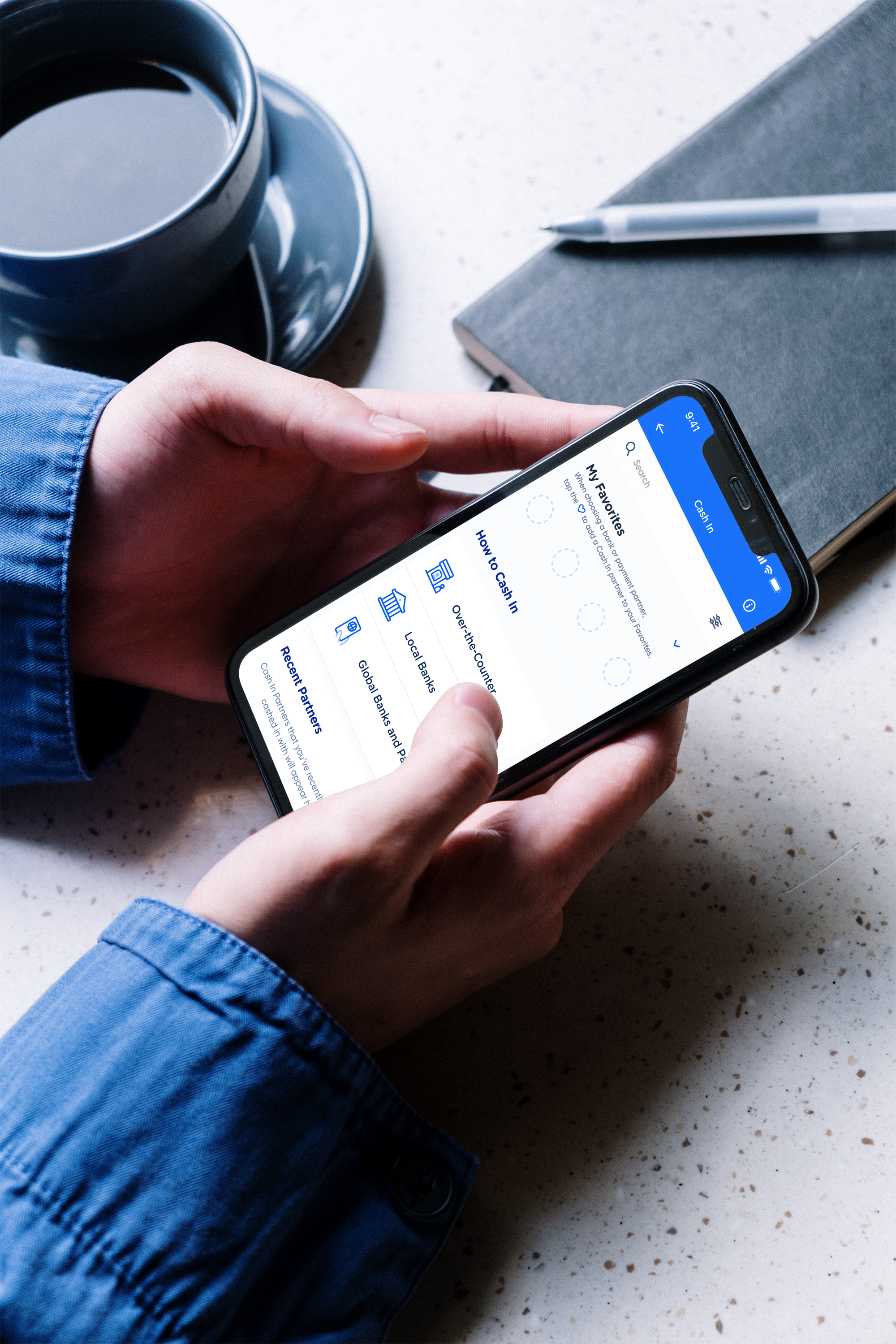
cash in experience
for a leading e-wallet
project scope
The Philippines’ biggest e-wallet has over 21 million users regularly cashing in and out from over 140 partners. I redesigned the e-wallet’s Cash In and Cash Out experience to become more organized, easier to navigate, and more delightful to use.
Customer experience architect
User experience designer
My role
Digital experience team
Offline Cash In and Cash Out delivery team
Online banks delivery team
Global partners delivery team
International banks delivery team (new!)
teams involved
The challenge
How might we optimize the display and accessibility of over 140 CICO partners in an organized and easy to digest manner?
Reviewing the existing experience
The product’s experience had several issues with design and usability. These were the key issues I identified:
The dashboard was quite noisy because there were so many elements on the page
Multiple partners were displayed for every Cash In category, with a horizontal scroll to view up to ten partners
Users have to click on the ‘View all’ button to view all partners for that category
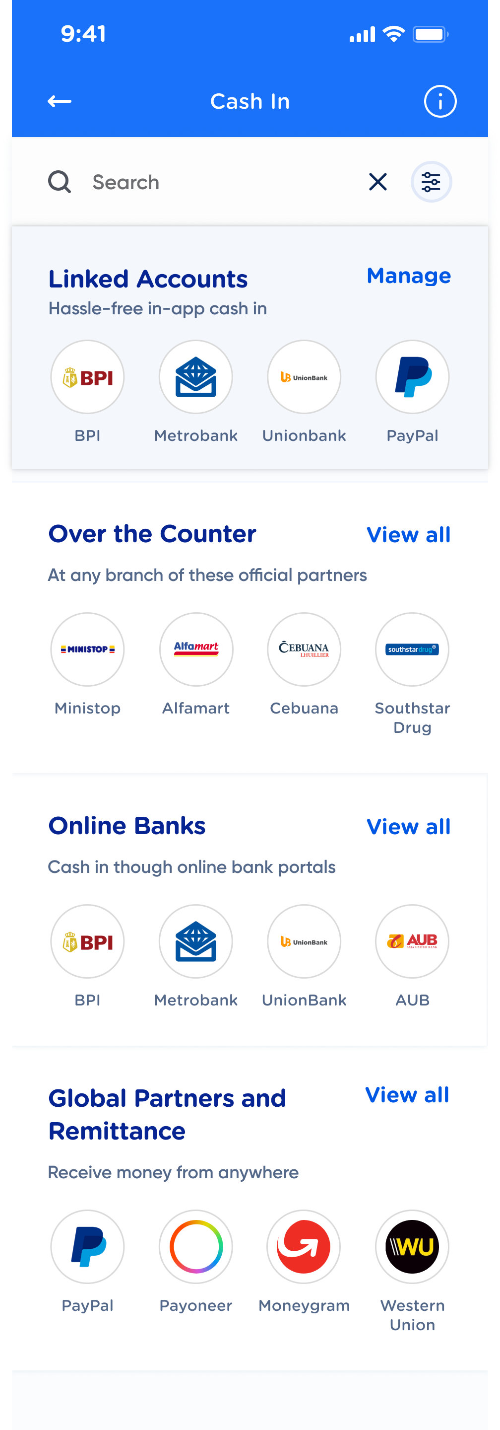
A Cluttered dashboard
ISSUE #1
This is how the 140 Cash In partners are divided:
Over-the-counter shops - with 11 subcategories like supermarkets, department stores, pawnshops, etc.
Online banks - with 2 subcategories: banks that could be linked to the e-wallet and banks that could not be linked
Global partners - with 4 subcategories: global wallets, international banks, online remittance claims, and physical remittance centers
(almost) endless scrolling on the category pages
ISSUE #2
All subcategories and partners are listed consecutively on a single page making for one long scroll
Because the subcategories had a small font size and light color, it was difficult to spot where each subcategory began and ended
ONLY 4 PARTNERS COULD BE QUICKLY ACCESSED FROM THE TOP BANNER
ISSUE #3
Only two online banks and two global e-wallets could be linked to this e-wallet
Since the top banner was limited only to linkable partners, this meant that only these four partners could be on the top banner
If a user frequently used any other partner outside these four, they would have to constantly dig and scroll through the use case every time they needed to cash in
A (five) team effort


The two use cases of Cash In and Cash Out involve four different delivery teams (over-the-counter CICO, online banks, global partners, and international remittances) along with the digital experience team. Together, the entire CICO squad is composed of:
• 6 product owners
• 3 solutions designers
• 3 solutions architects
• 2 quality assurance checkers
• 5 front end developers
• 8 back end developers
I discussed my design review findings with the Digital Experience team and with each delivery team involved with CICO. I gathered insights from each team regarding users' behavior with the different CICO categories and subcategories.
I was also able to get feedback from the different product owners about how they felt their products' experience should be.
These discussions helped all of us collaboratively build the revamped CICO experience.
OUR NEW product PRINCIPLES
From all these discussions, we set the following experience principles for the Cash In and Cash Out use cases moving forward:
give users an overview of the cico methods and partners available to them without the visual clutter
allow users to easily browse through the different cico partners
give users quick access to their most used cico partners
optimize how users search for cico partners
Iterations
First iteration: UI revamps & accordions
Homepage version 1
Homepage version 2
Over-the-Counter category page
Changes
I updated the landing page's UI to the app's refreshed UI.
I removed the map and placed it within the Over the Counter page (since the it is the only Cash In category where users would need the map).
I limited the number of partners shown on the landing page to 3-4. Users would have to click 'View All' to view the rest of the partners.
I enhanced UX of the subcategory list by:
- Reformatting the font style for each subcategory header to make its text more visible (i.e. Supermarket, Department Store, etc.)
- Creating collapsible accordions per subcategory. Users could now collapse subcategories and shorten their need to scroll as they explore through the CICO partner list.
Issues with this iteration
The landing page was still cluttered with too many elements. I needed to find a way to clean this up further.
The accordion solution might not be the best solution for the over-the-counter category since it has 11 subcategories. That still makes for a long scroll
Users could not yet easily browse between categories. They must always return to the landing page to access another category and partner list.
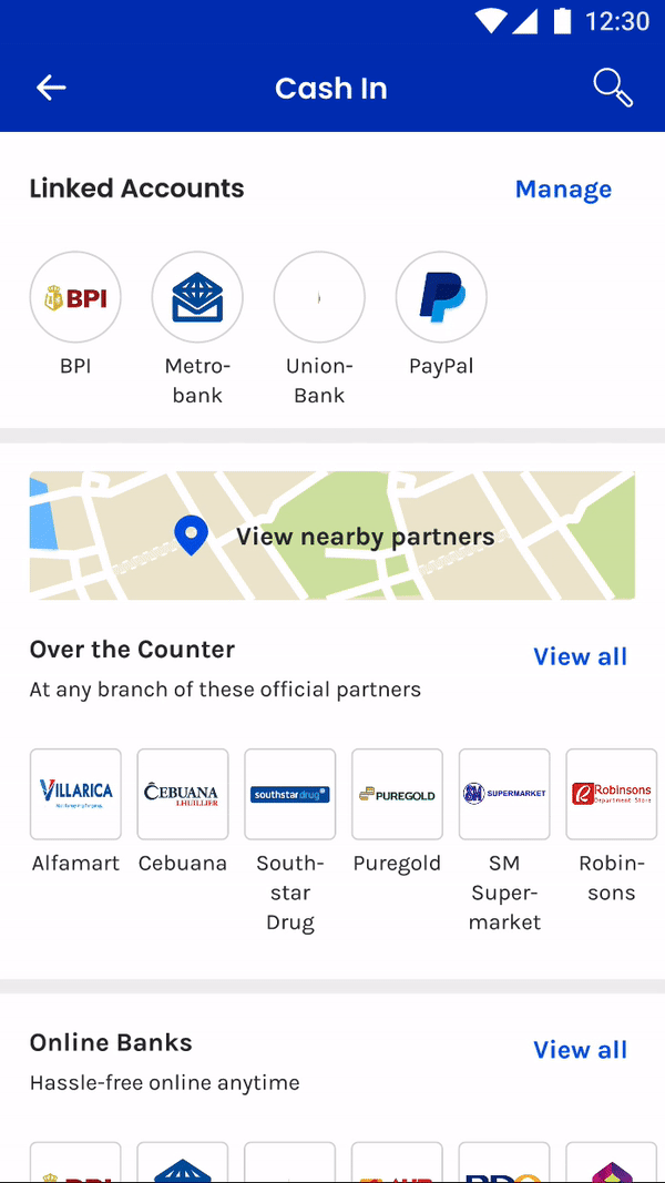
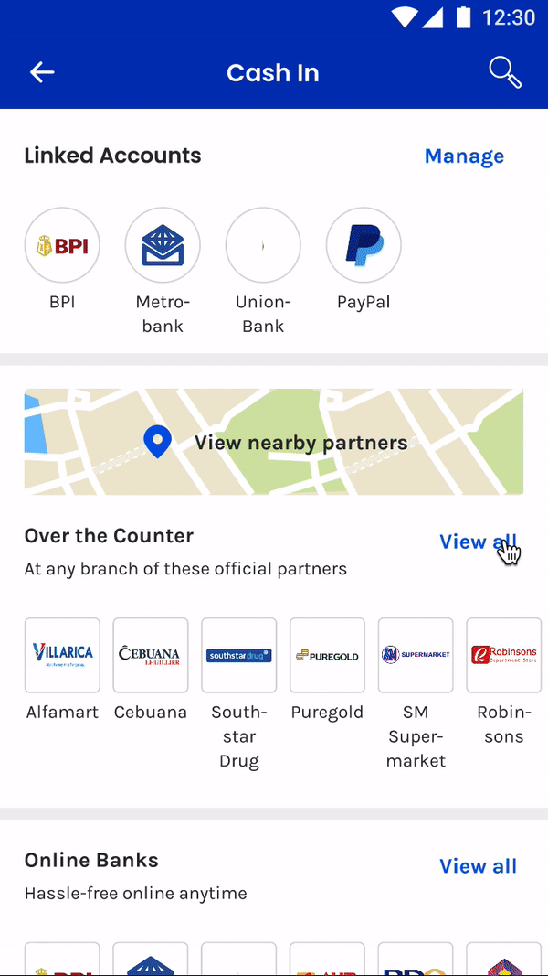
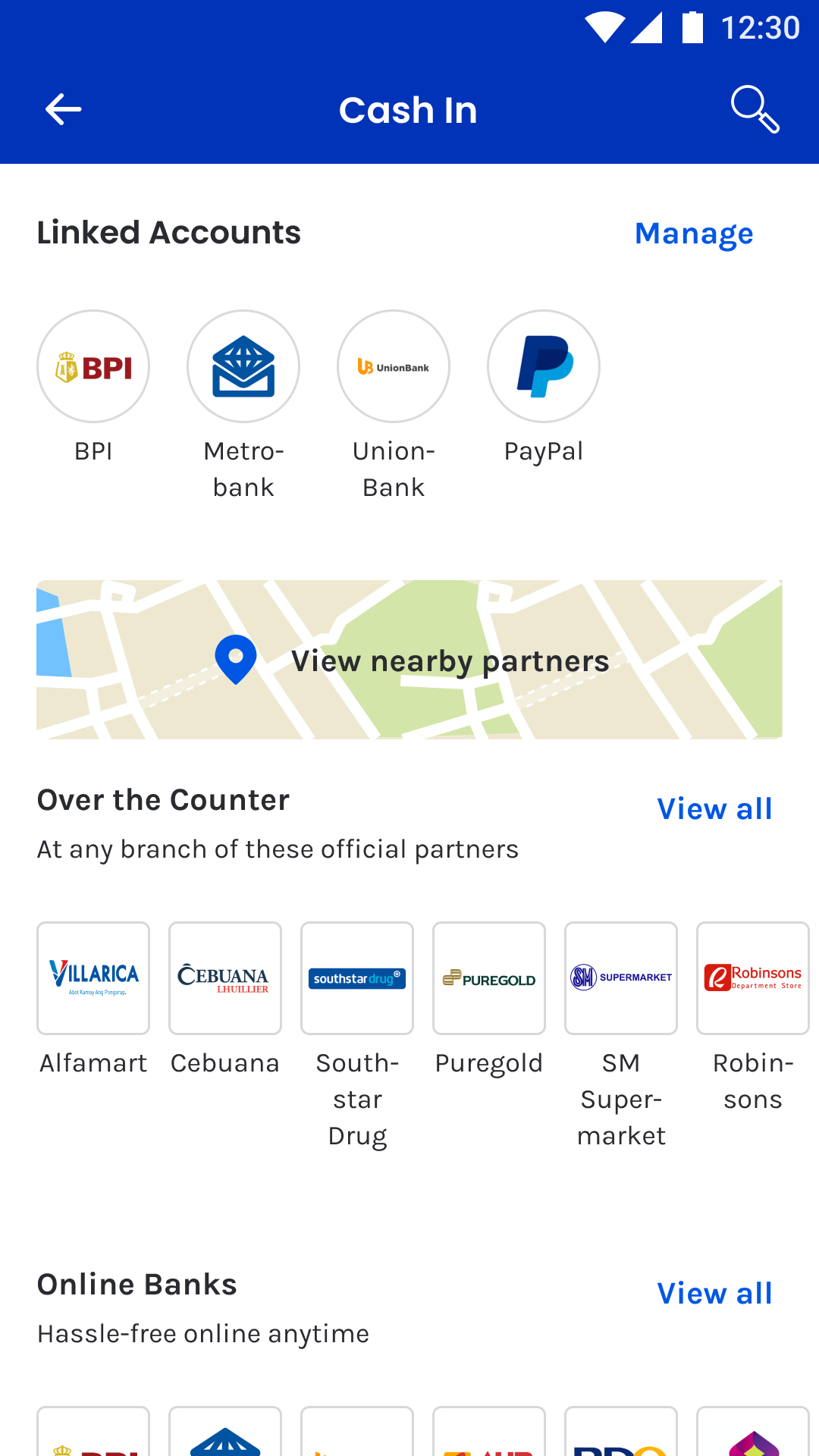
Second iteration: Tabs & accordions
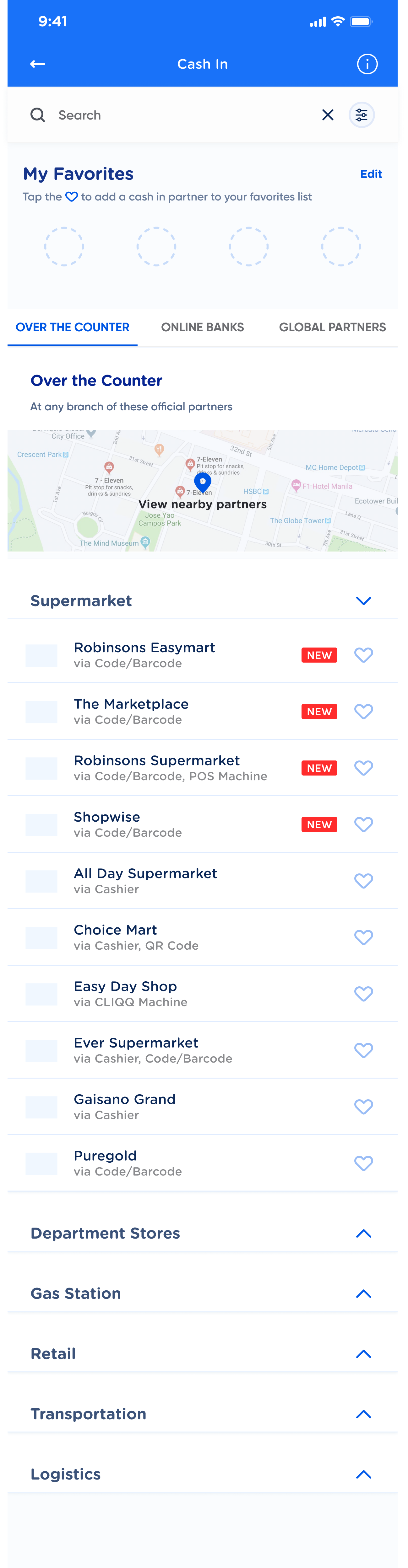
Tabbed dashboard - Over-the-Counter page
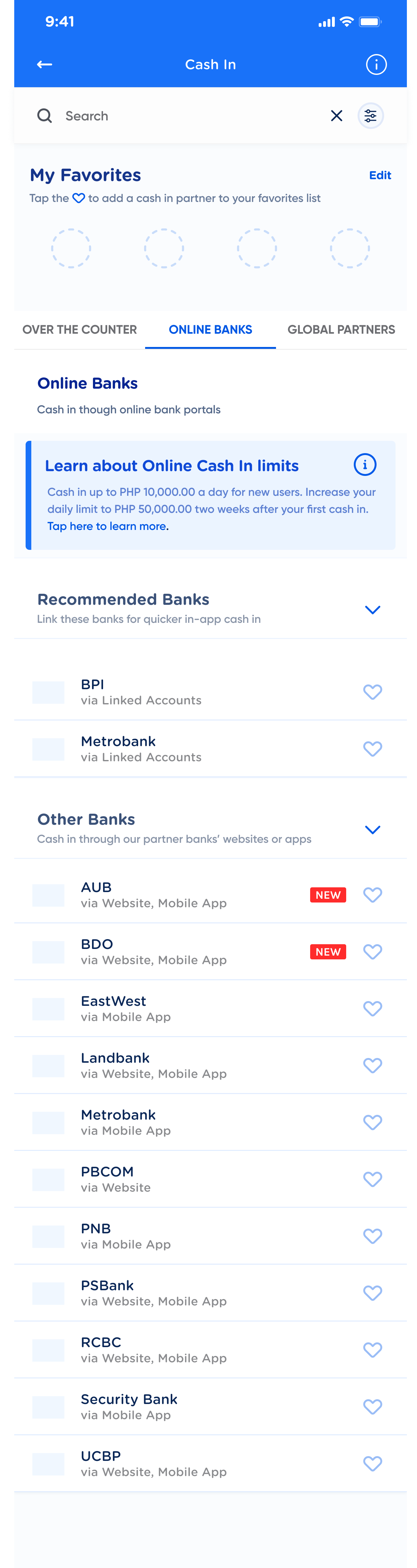
Tabbed dashboard - Online Banks page

Tabbed dashboard - Global Partners page
Changes
I tabbed each category so that users could easily navigate through Cash In categories
Effectively, all categories, subcategories, and partners were now on the landing page
All partners could now be added to the favorites tab. This meant that if a user frequently uses a non-linkable partner, they could now access this partner from the favorites tab with one click!
Issues with this iteration
Tabs made navigation much smoother, but having each category, subcategory, and partners on the landing page made it even more cluttered and overwhelming to look at
Miller's law was burning in the back of my mind. This law states that the average person can only hold about 7 (plus or minus 2) items in their working memory at a time.
How might I implement this law onto the Cash In landing page?
final screens
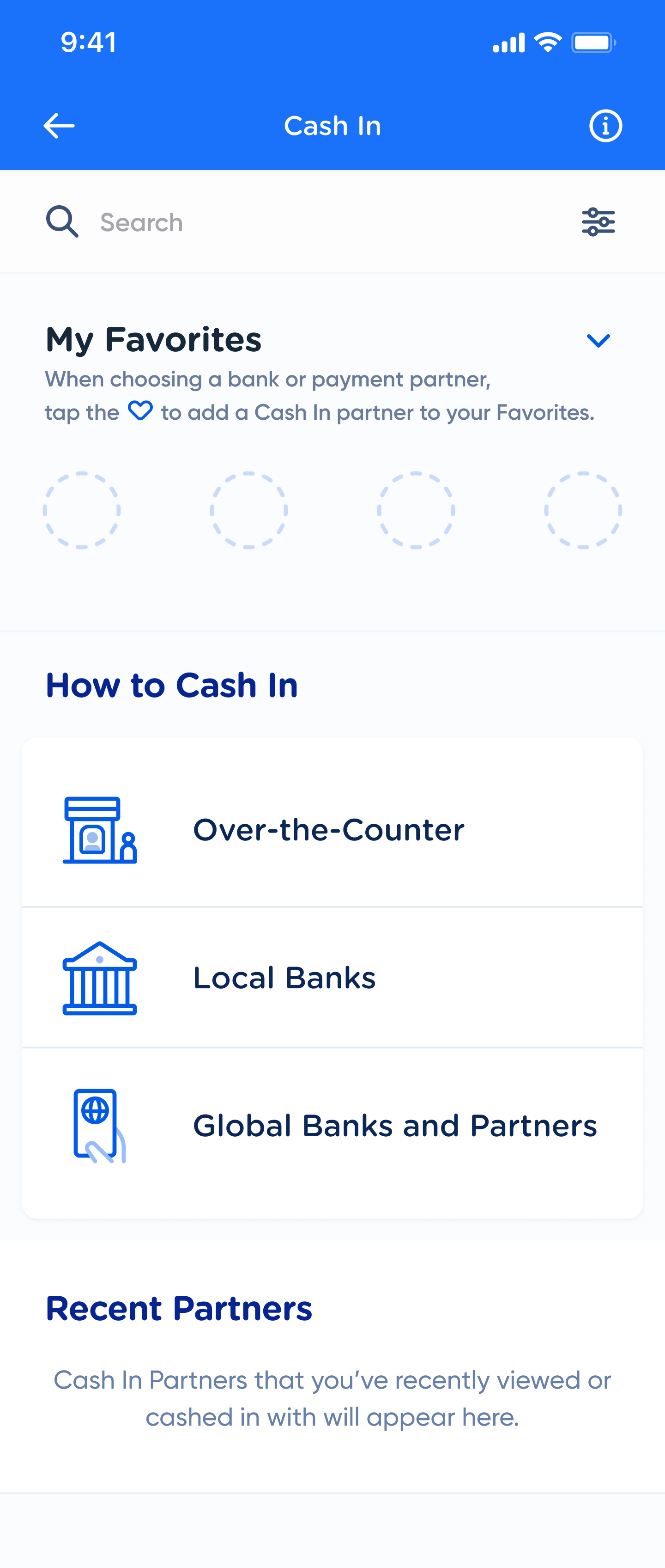
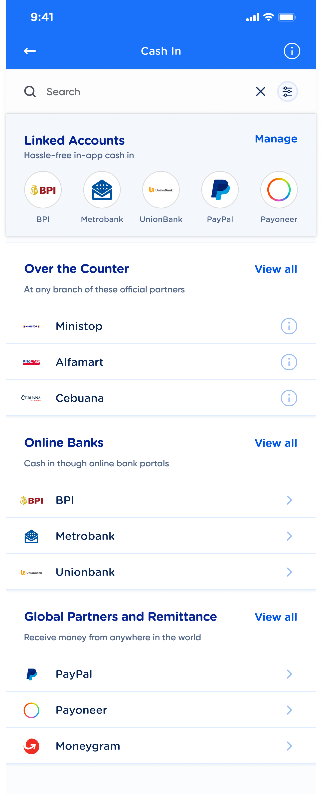
This is the final Cash In dashboard (empty state). It consists of the users' favorites, the three Cash In methods, and their recently viewed partners.
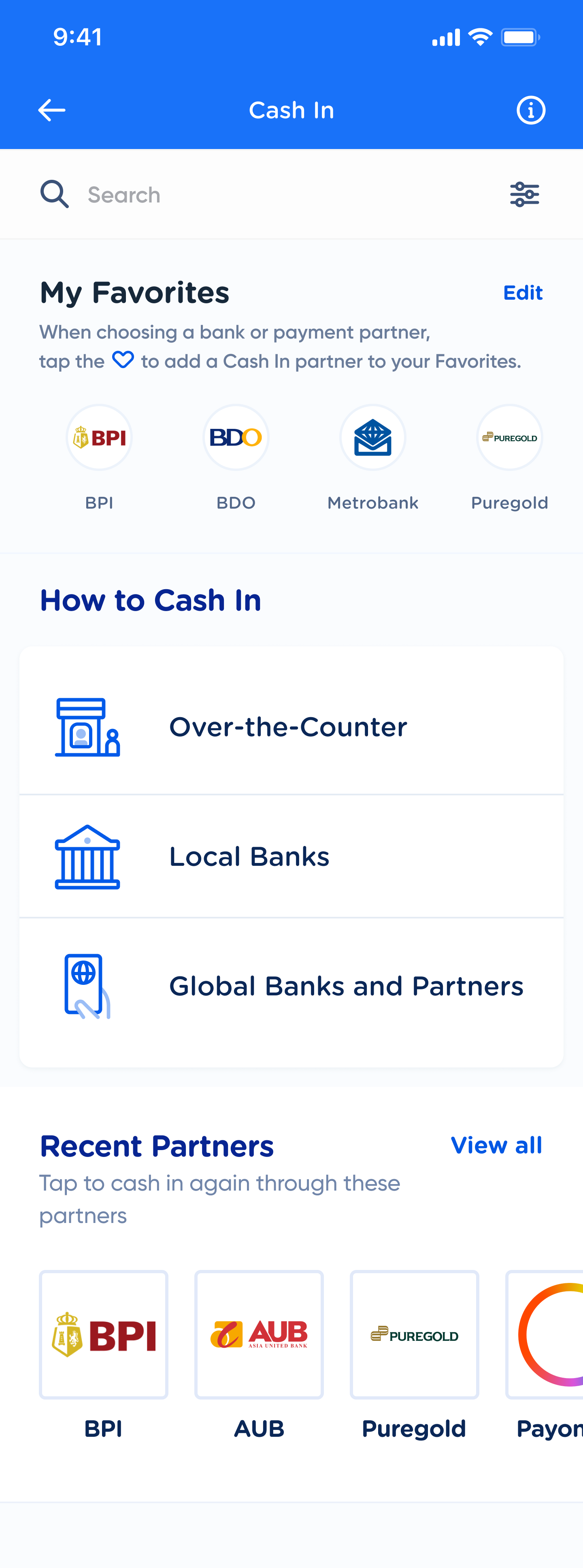
This is the Cash In dashboard (filled state). Users can add up to 20 favorites and view up to 15 recent partners.

This is the over-the-counter tab. The 11 categories are displayed in an icon menu, for a better bird's eye view to the user.
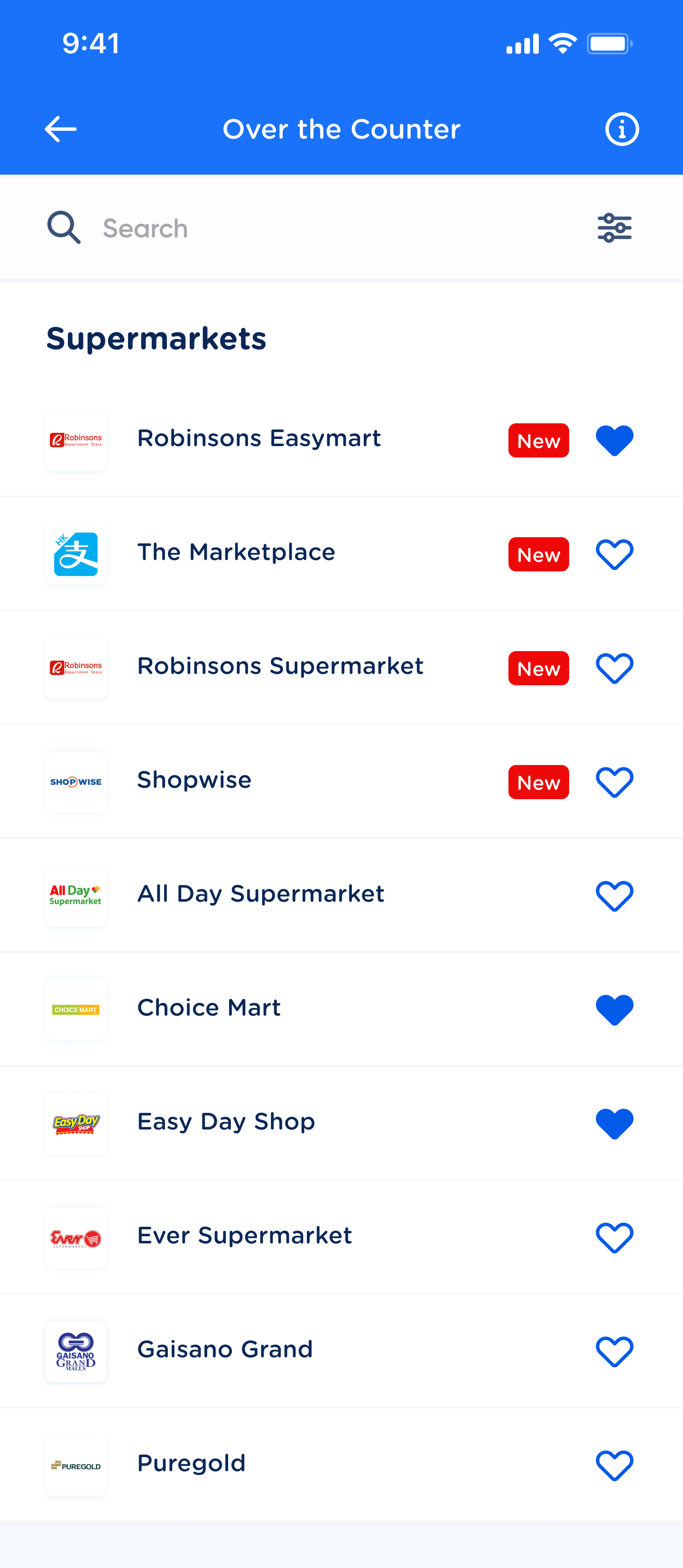
This is a partner list of an individual over-the-counter category. Users can see all partners under that category and add their favorites.
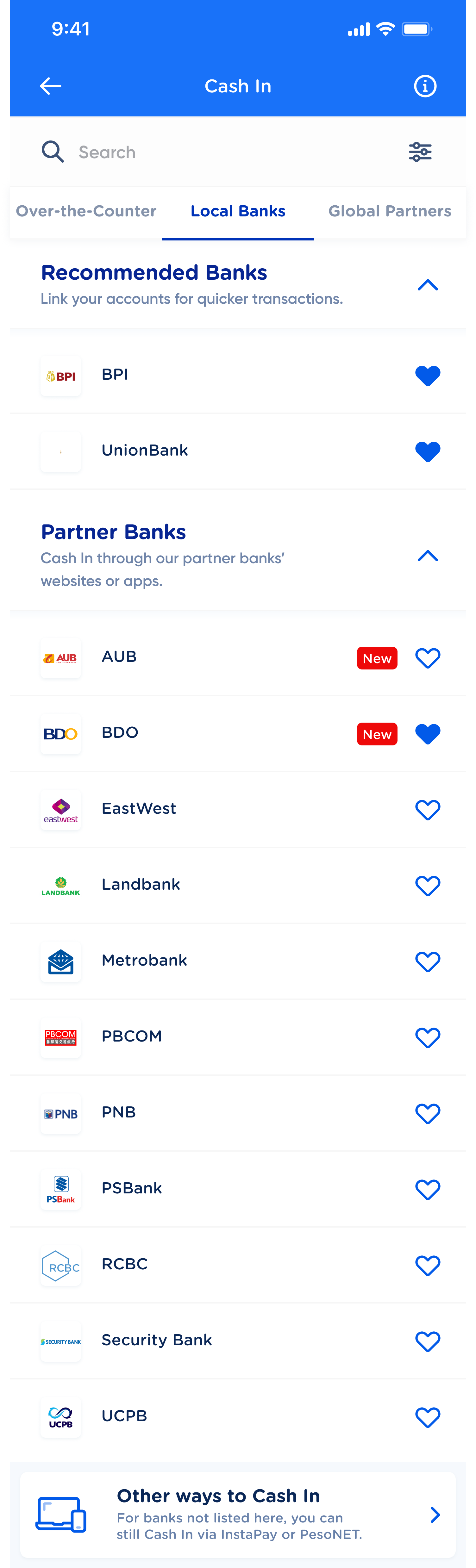
This is the local banks tab. Users can see which banks they can Cash In with, as well as alternative methods to Cash In with banks not found on this list.
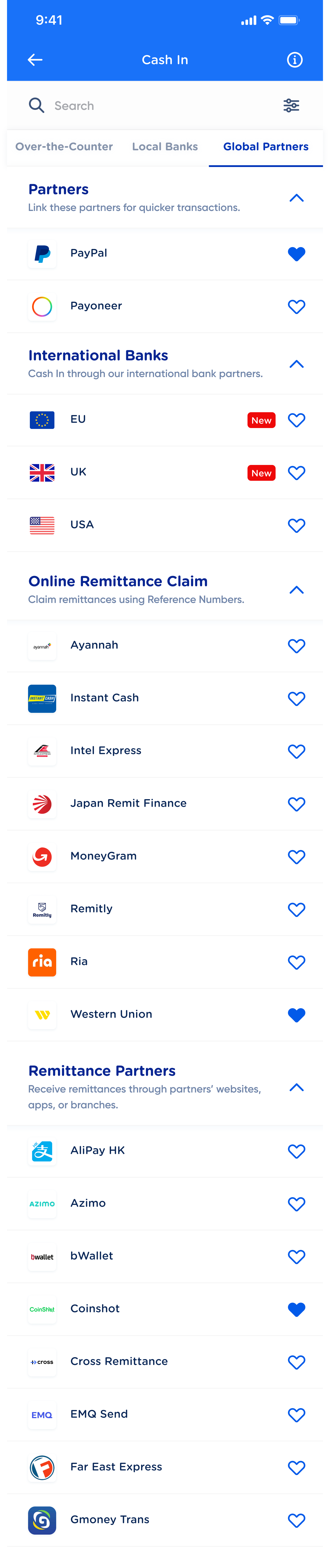
This is the global partners tab. It is similar to the local banks tab, just with a few more partner categories.
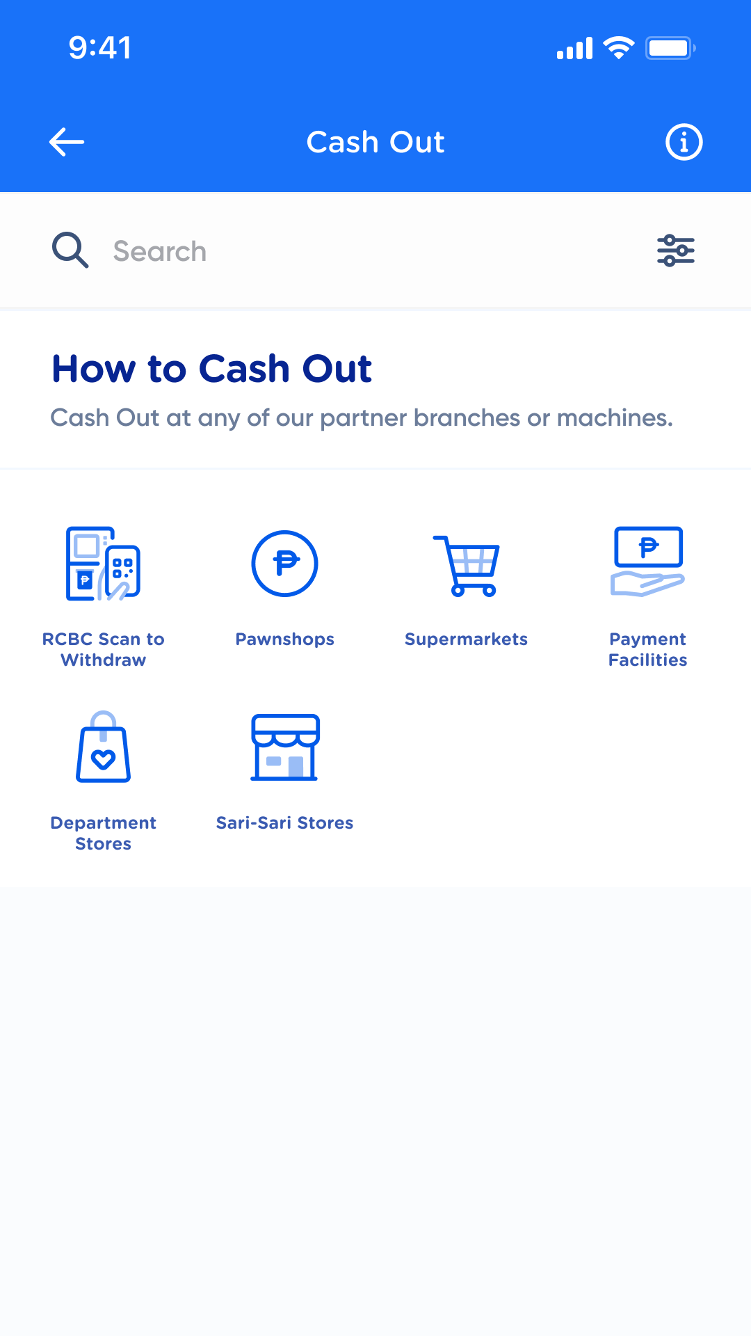
This is the Cash Out dashboard. Since most Cash Out partners are over-the-counter, we adopted the UI of the over-the-counter tab.
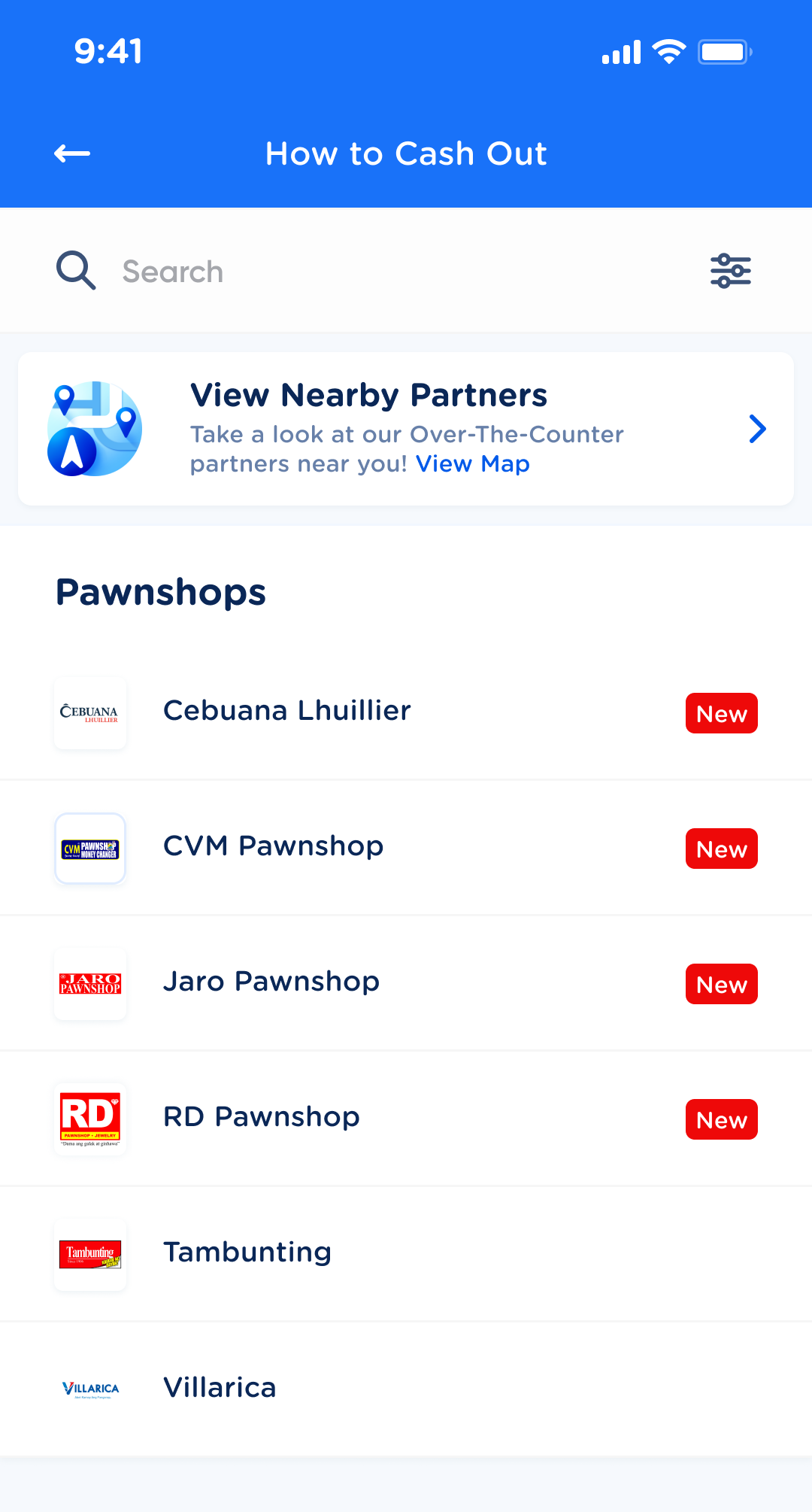
This is the partner list per category. It has the same UI as that of the over-the-counter partner list.
enhancements
dashboard service list
Users would only see three sections on their dashboard — their favorites list, the three main Cash In methods, and their recently opened partners.
Favorites & one-click access*
All Cash In partners could now be favorited. Users could favorite their most used Cash In partners and access them from the dashbaord with one click. They would no longer need to go into the Cash In methods and browse through.
*We opted to remove this feature from the Cash Out product upon advise from the Cash Out product owner.
recent partners*
Users could also see and quickly access their recent partners from the Cash In dashboard.
*We opted to remove this feature from the Cash Out product upon advise from the Cash Out product owner. icon menu & accordions
For the over-the-counter category that had 11 subcategories, it was cleaner and more efficient to put them into an 11 icon menu. Users could view the partner list of each subcategory by clicking on the icons. For local banks and global partners, I retained the collapsible accordions to give the users the affordance of shorter scrolling.
Bonus: enhanced search feature
This is what the search function looks like if there are no recent searches.
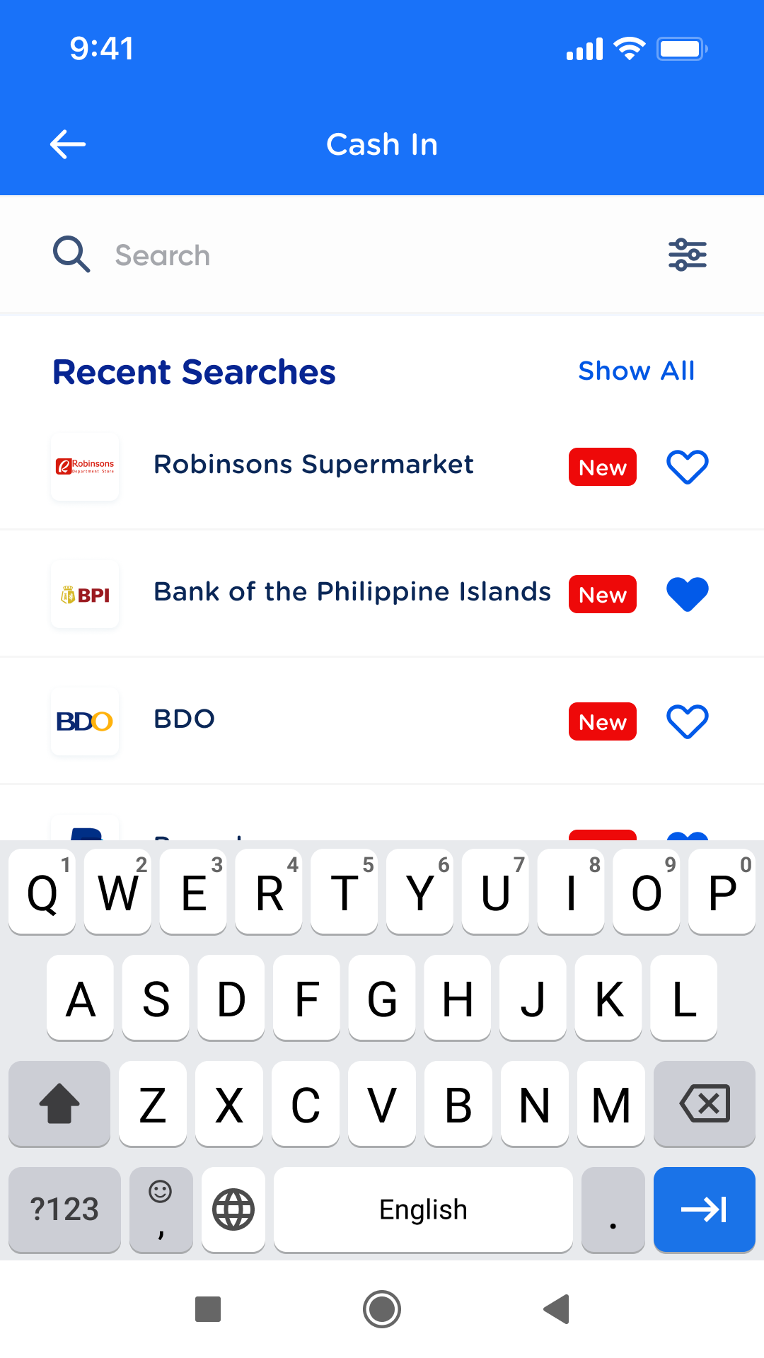
This is the new recent searches feature, aka what the user sees when they click on the search bar and they already have existing recent searches. These can also be cleared (under Show All > Clear recent searches).
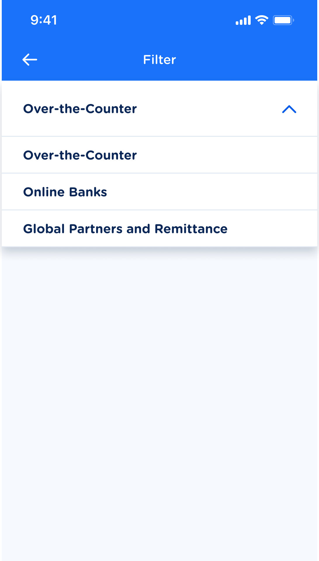
This is also a new feature I designed — a filter to filter out partner searches by Cash In method.
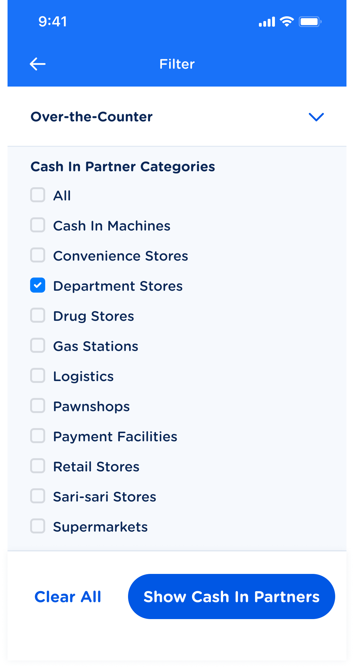
Users can select which main method they want to explore, check which category they want shown, and show all the Cash In partners that correspond to their selections.
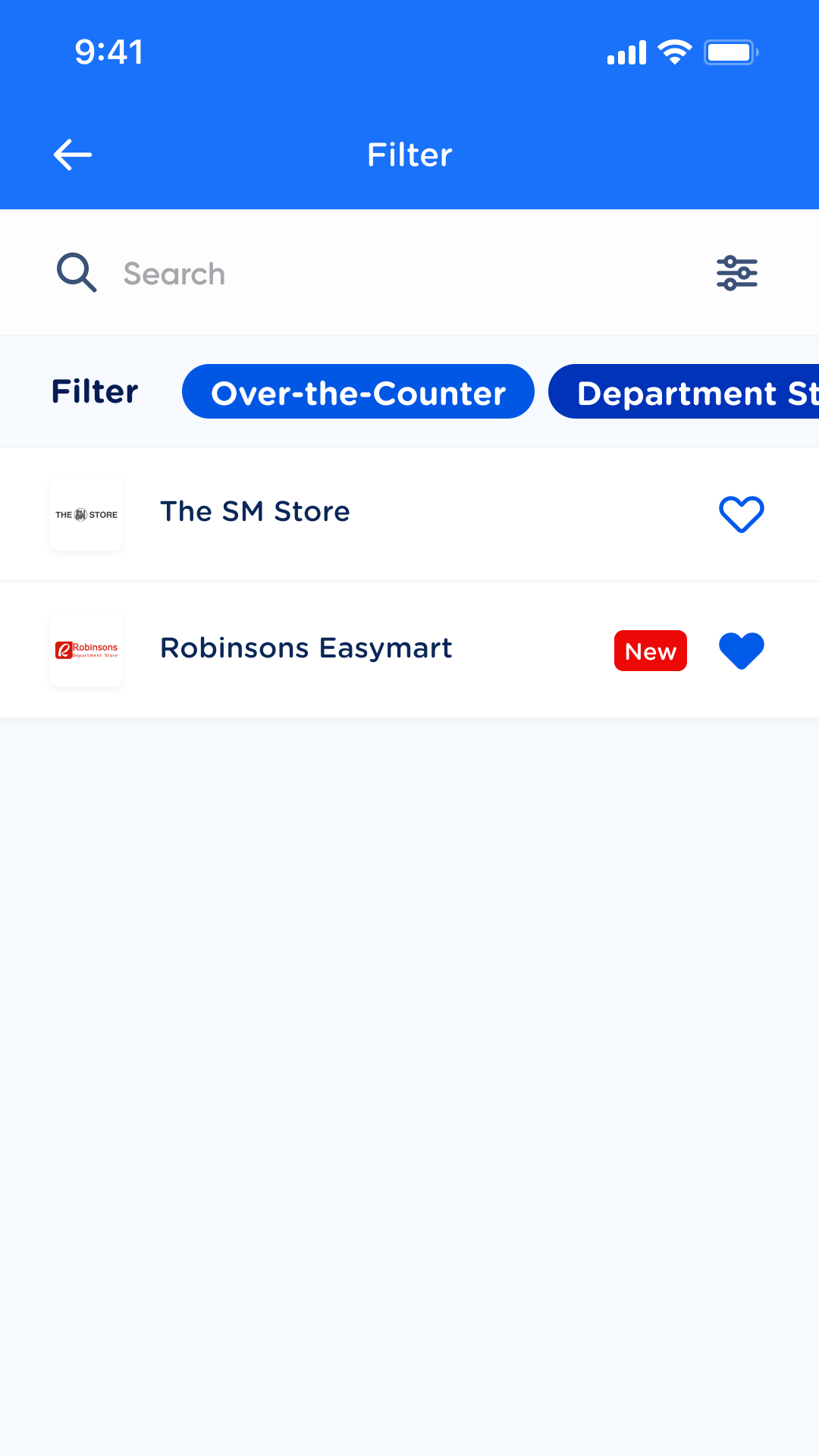
Filtered results will be shown like this. The selected filters will also be displayed. Users can easily clear the filter as well by clicking on the filter and clicking the 'Clear All' button (as seen in previous photo).
I enhanced the product’s search feature to include new functionalities, such as:
stored recent searches
Users could now access their recent searches and clear them if needed.
a brand new filter
Users could filter their search based on categories and subcategories. They could select whichever category they preferred and view the partners for one or several subcategories. This feature is most useful for the over-the-counter category given its plethora of subcategories and partners.
AND OF COURSE, ENHANCED CASH IN SCREENS
For an overall delightful, visually pleasing, and cohesive Cash In experience. Featured here are the Cash In screens for PayPal, a global Cash In partner.
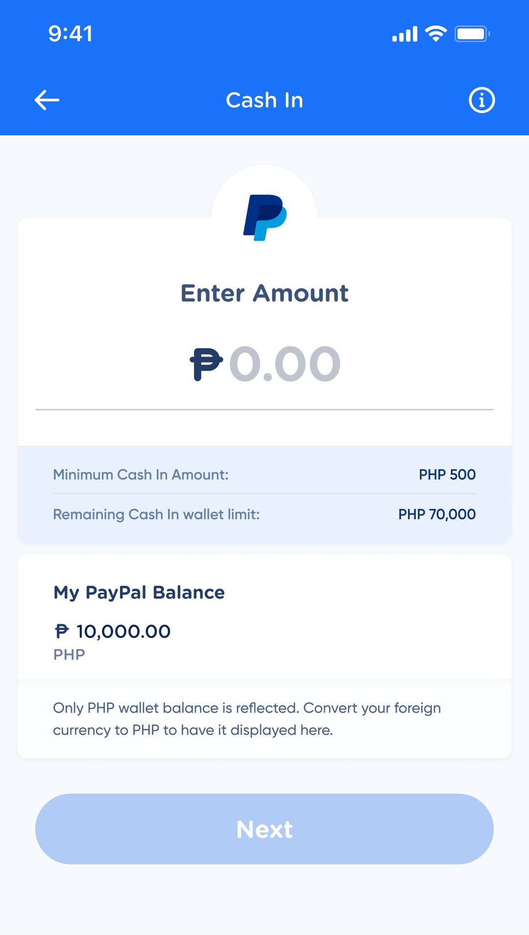
This is the revamped Cash In page. It puts an emphasis on the Cash In amount (to avoid common oversights in amount input) and also informs the users of their Cash In limits and their external wallet balance.
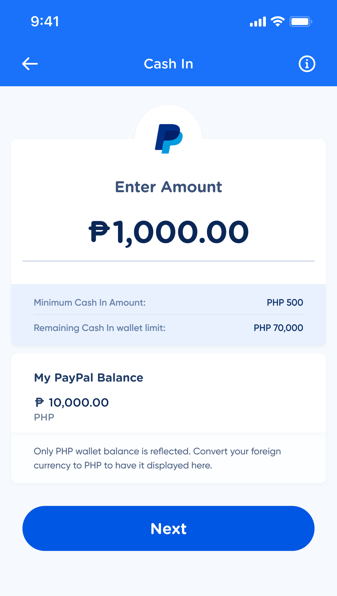
If the amount entered is valid (within all specified limits), then the Next button is enabled and the user can proceed with their cash in.
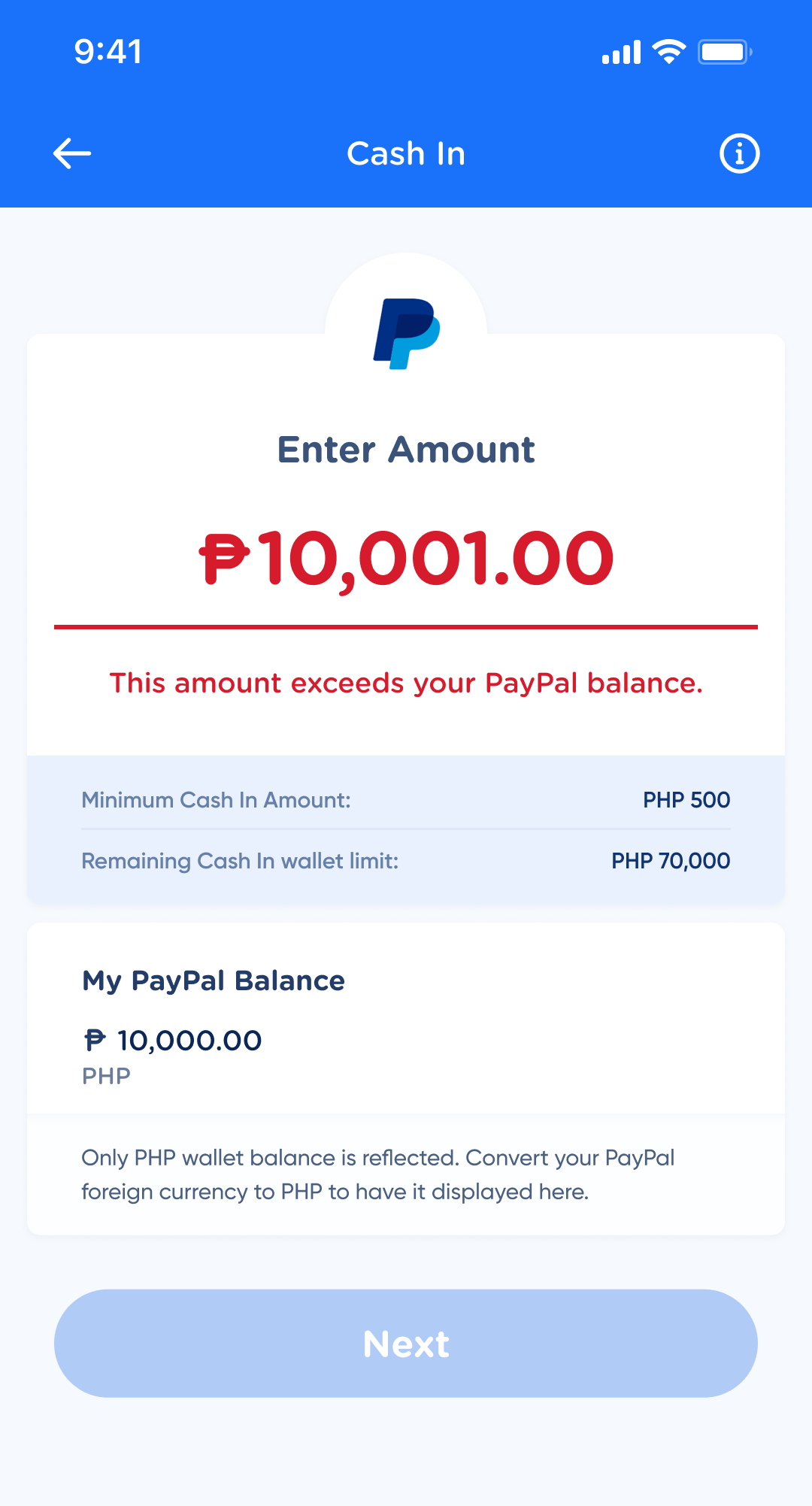
If the amount entered is invalid (violates any limitation), then it will appear in this error state and the Next button will not be enabled until this is corrected.
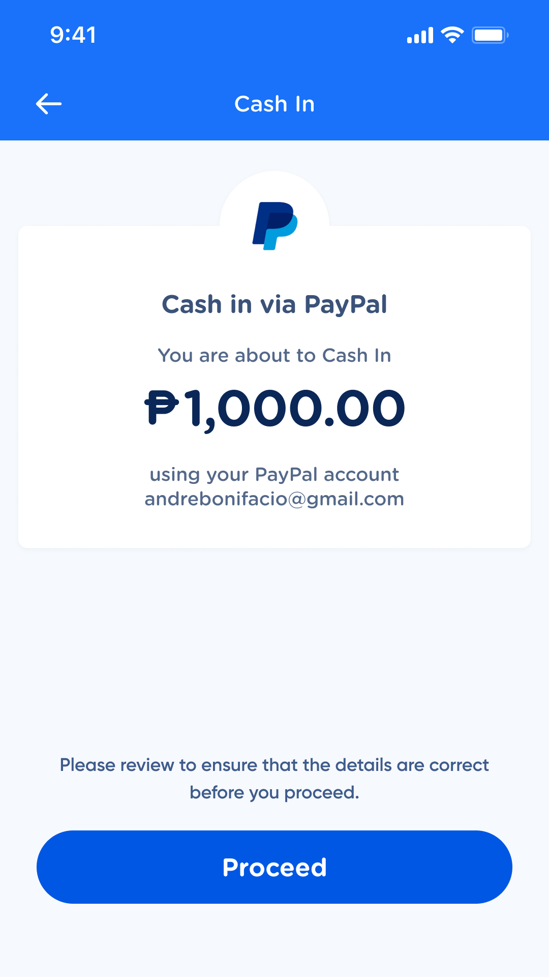
This is the revamped confirmation screen. The amount is enlarged to ensure that the user can clearly see how much they are cashing in before they confirm the transaction.
Chunking cico
A short reflection on what I learned from working on this project:
Miller’s law teaches us to use chunking to group large sets of information into smaller clusters in order to help users view, understand, and utilize information more easily.
The CICO redesign allowed me to apply Miller’s law as efficiently as I possibly could. Aside from it being an exercise in information architecture, this project was also an exercise in showing the user what they needed to see depending on where they were in their journey.
For users who already had favorited partners, they wouldn’t need to see the partner lists unless they were looking for new partners, so it was fine to nest the partner lists within the service list menu on the dashboard.
For users who would need to browse through the partners, the tabs, icons, accordions, and enhanced search allowed me to group the partners more effectively as well as give users affordances to reduce the amount of scrolling they had to do.
Just because a product is complex, does not mean it has to be complicated. This case study taught me just that. Over 140 partners have been packaged neatly into an easily understandable and navigable product. The browsing experience has been transformed from tedious to smooth. And users have been given the option to have a one-click access to any partner they favor.