Designing a menu page for a meal planning website
Food Industry • Desktop • UX/UI
quick context
The company is a meal planner providing premium, delicious, and customized meal programs. All their meals are designed by renowned chefs, tested by dieticians, and freshly cooked every day. They are the best in healhty food delivery service in their base country.
Most of their customers reach out to them asking for the weekly menus of their different meal plans. Before this project, the website only showed the different meal plan categories, but not the individual dishes per day and per week.
Visual designer
Interaction designer
My role
Visual design team
Interaction design team
Client
teams involved
The challenge
Create a weekly menu page for every meal plan category & a dish detail page for every dish.
what were we working with?
There were ten different meal plan categories.
Gluten-free low carb
Lighter delights
Ketogenic diet light
F45 challenge
Optimal performance
Vegetarian

Paleo
Mediterranean
Vegan
Asian
Each meal plan category would have 3 different meals per day (for breakfast, lunch, and dinner). The three meals a day were usually unique, but meals could be repeated on different days throughout the week.
Users wanted to be able to see all the different meals that would be available per week for each meal plan.
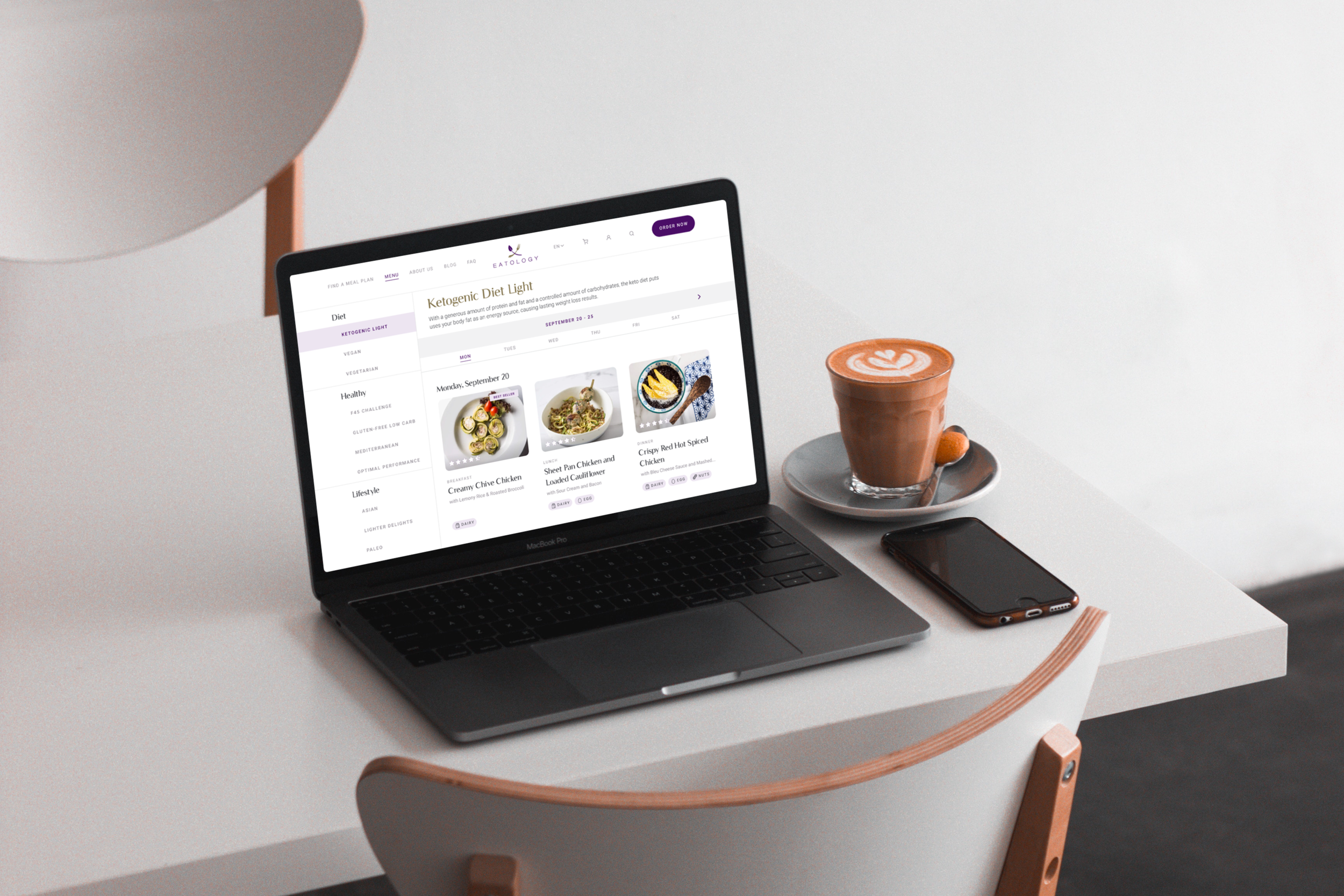
designing the menu page
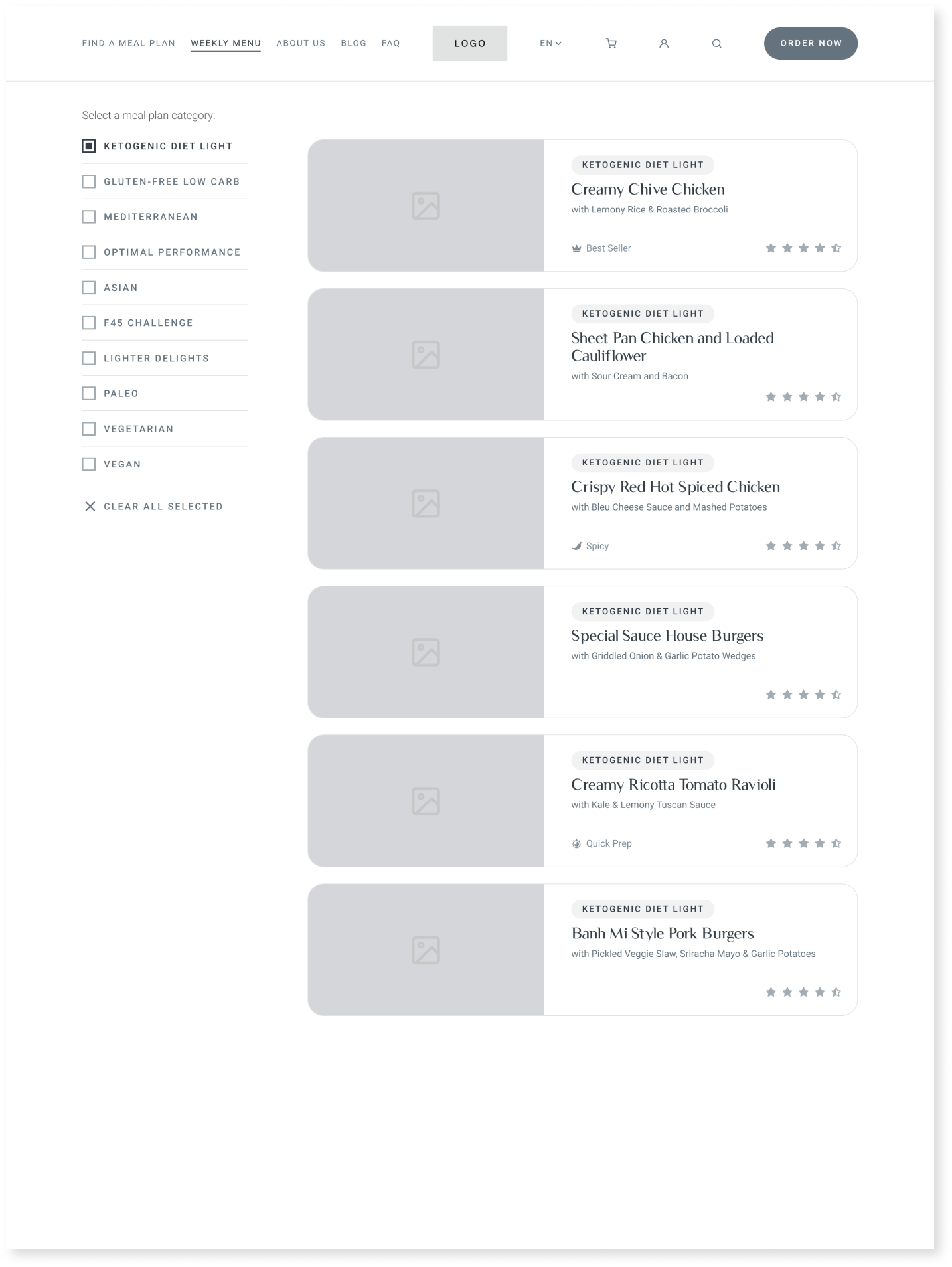
This was the initial wireframe. We realized that even without the multi-select feature, this would be quite a long scroll for users. This version also does not indicate which meals correspond to which day of the week.
This second iteration streamlined information much better than the first. However, we found the buttons on top a little too heavy. The accordions were also not too sustainable a design since they would pile up if users kept collapsing them onto each other.
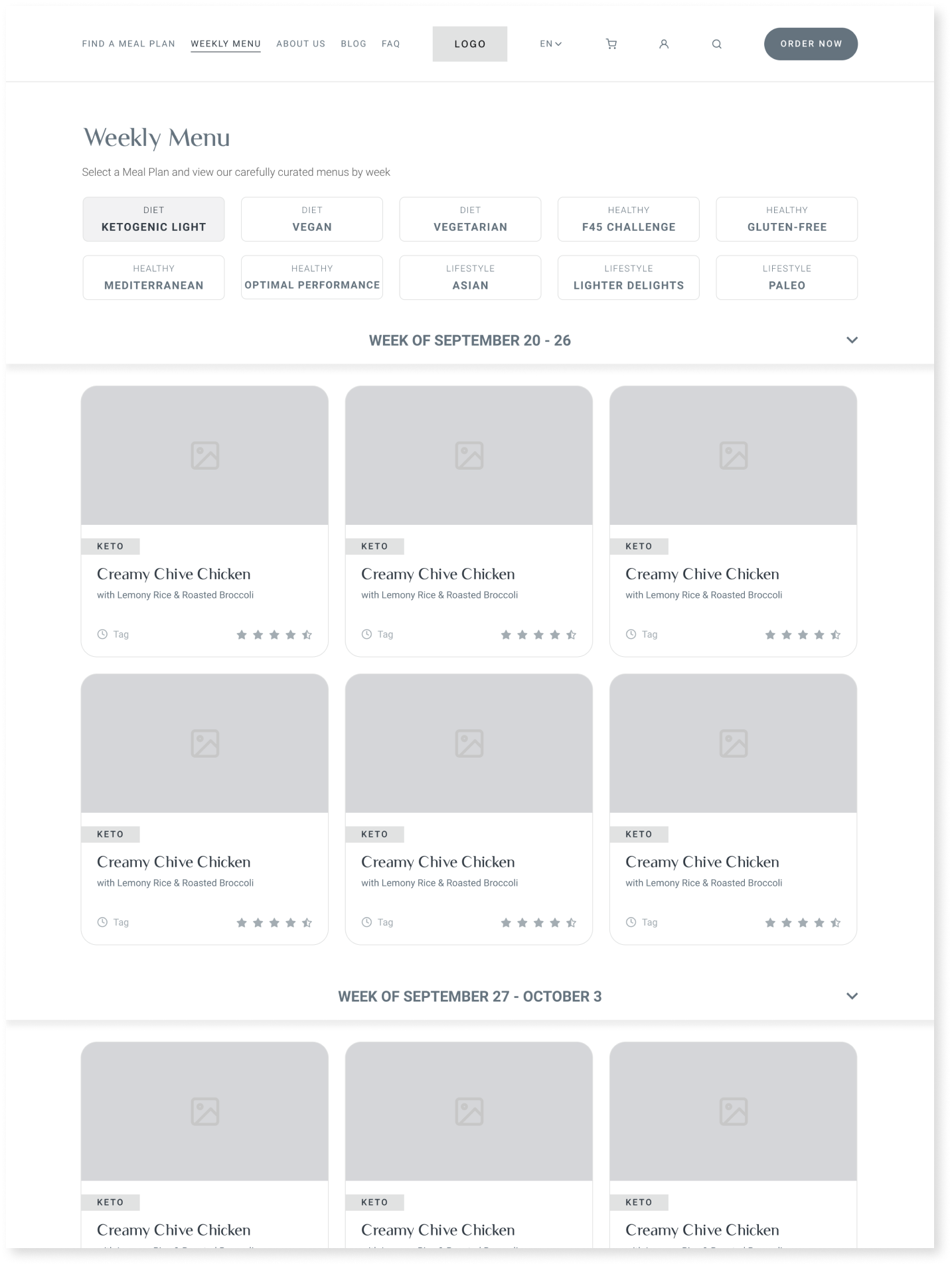
This version was the winner for a good number of reasons…
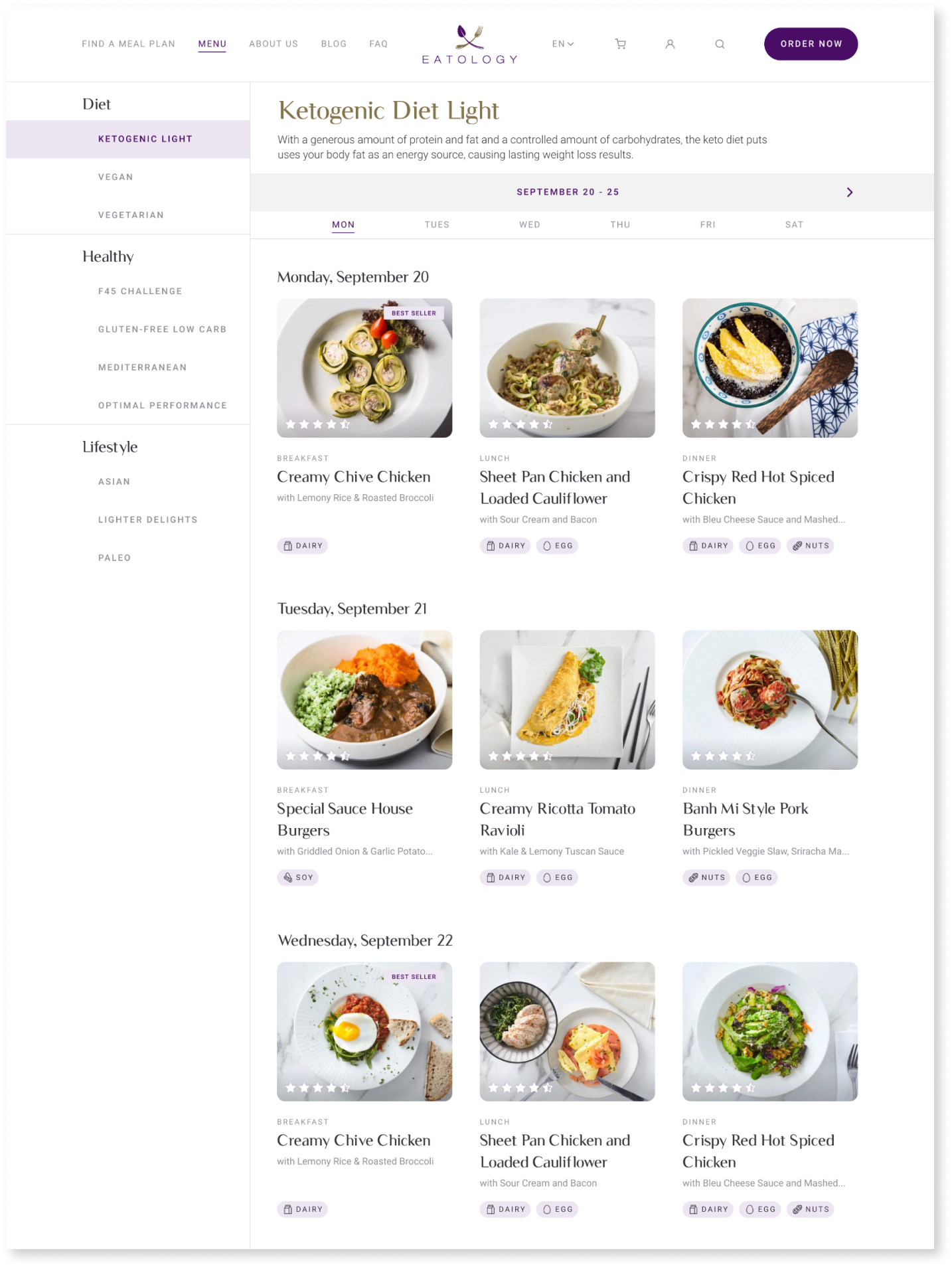
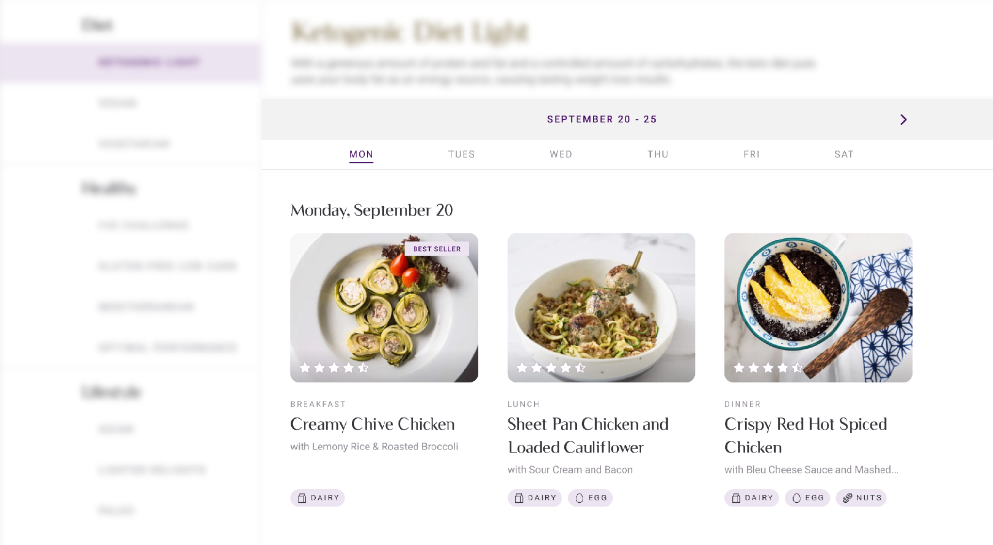
better category organization
Each meal plan category fell under 3 bigger categories: diet, healthy, and lifestyle. We were able to visually communicate this through this layout.
We were also able to create the real estate to include a brief description of the meal plan for users who weren’t too familiar with these different diets (fun fact: this feature was personally suggested by me as a user who was not too familiar with these different diets).
The side bar was sticky as well for users to easily explore between categories.

Easy navigation
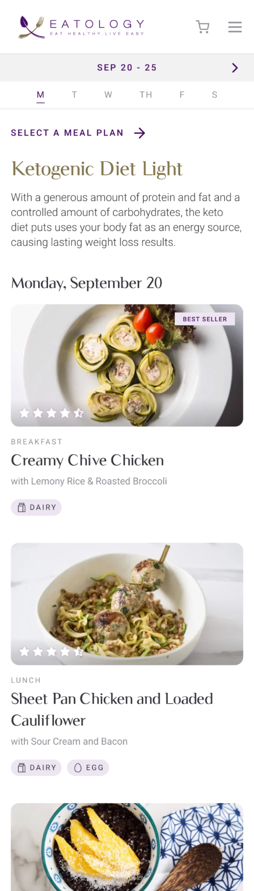
Each page corresponded to 1 week of meals. Users could move to the next week by pressing on the right arrow beside the current week (or left arrow if the previous week was still available).
Each row corresponded to the three meals of the day. Users could scroll down to the next day or click on the day of the week to have the page scroll down to it.
The week and days of the week header were sticky so users could easily click and navigate with it.
“Lighter” card design
We also designed a lighter card to complement the content-heavy nature of the page. As opposed to the previous cards, we removed the frames/borders and let the text just rest freely below the image.
Each card tells the user how highly the dish is rated, which meal the dish corresponds to, the dish name, details, and allergens.
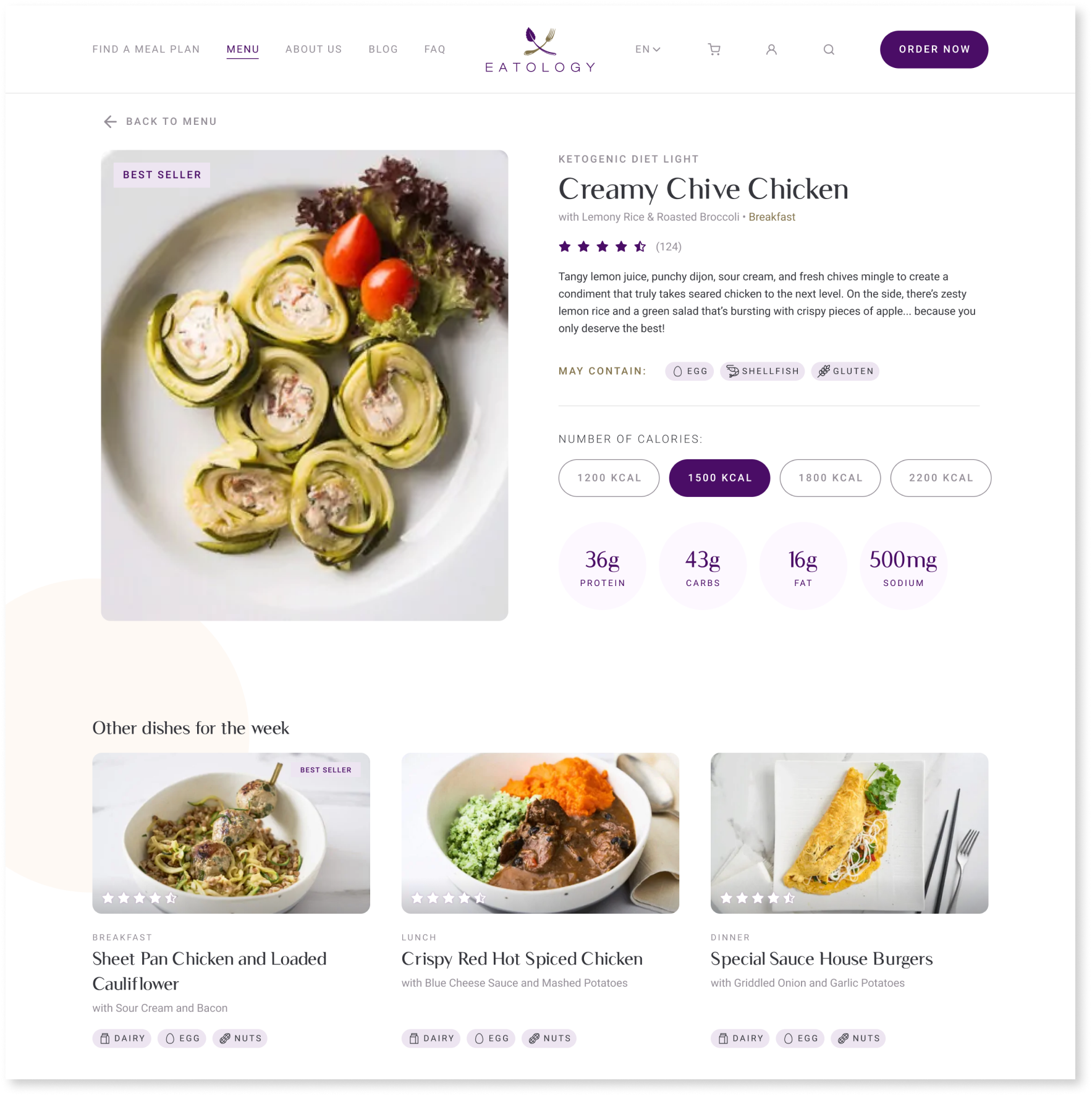
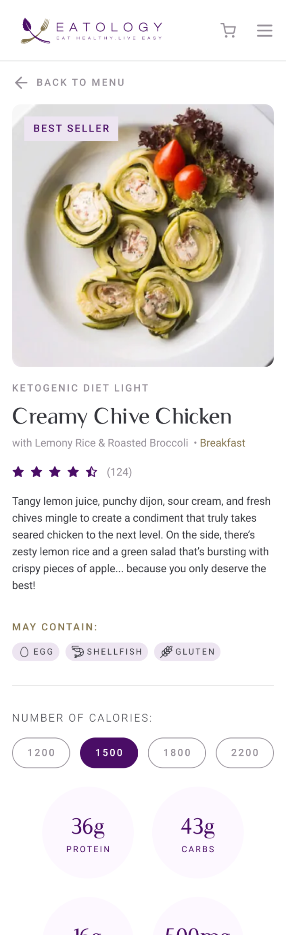
Dish detail page
When users would click on each dish card, they would be directed to the dish detail page.
Dish photo (with violator if the dish is a best seller)
Details like the type of diet, dish name, dish details, dish rating, short description of the dish, and allergens
Nutritional summary
Depending on the number of calories customers would order per dish, they would be able to see the nutritional breakdown of protein, carbs, fat, and sodium
They would just need to click on the pill that corresponds to the calories of their purchased dish
We also included a recirculation section for users to explore more dishes
Elements of the page:
Mobile screens
We also designed corresponding mobile screens to ensure the responsiveness of the design!
the menu
A short reflection on what I learned from working on this project:
The UX principle of hierarchy — how visuals and information are arranged and laid out — determines how a user would navigate your product and how easy (or difficult) this would be.
The users of this product needed to be able to browse on different levels: they needed to see what all the meal plans were, they needed to see what each week’s dishes were, and they needed to see more details about the dish and its corresponding nutrition count.
Although only two were featured, we actually went through many iterations with this design until we found the one that showed the most information in the most clear way with the least number of steps the users needed to take to get that information.
When it comes to content-heavy sites, a balance must be struck between being informative, but easy to digest (pun intended!).