Real Estate • Desktop • Interaction Design
INTERACTION DESIGN FOR A residential condominium’s website
project scope
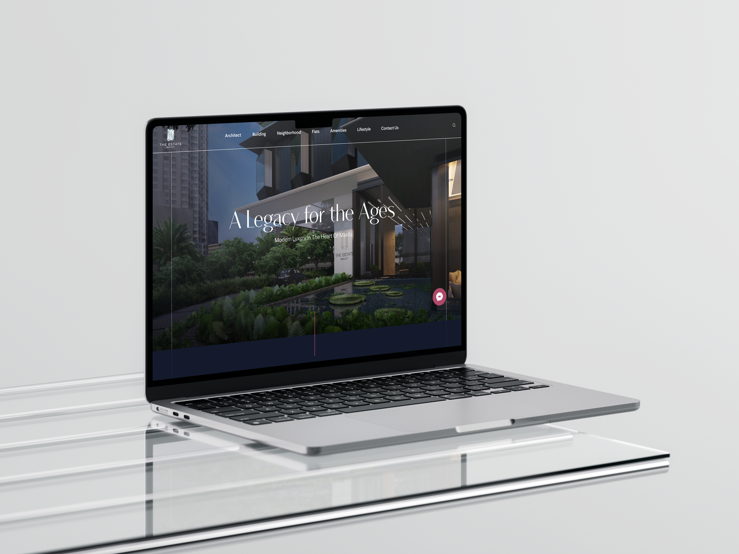
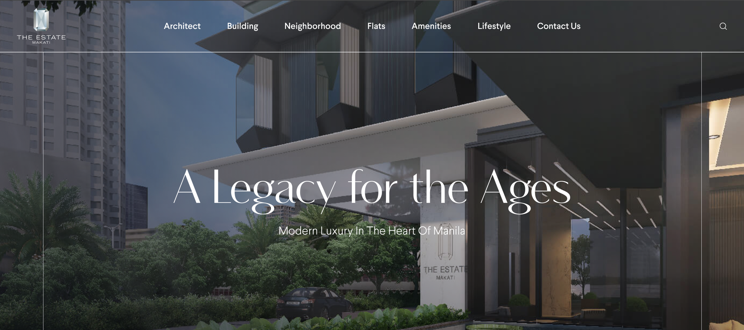
This premiere residential condominium is located at the heart of the country’s central business district. Beyond having a beautiful website that exuded both modernity and elegance, they wanted a highly interactive one.
When this project came to me, there were already existing interactions present. However, the client found them too unconventional for their target market that comprised of older, more traditional customers. They wanted the site’s interaction design to be as modern, but still as elegant, as their visual design.
Interaction designer
My role
Visual design team
Interaction design team
Client
teams involved
The challenge
How might we design interactions that give the site a modern feel, but will not overwhelm an older target audience?
I DESIGNED three main interactions FOR the site
-
This was best to feature a series of photos of the condo.
-
Elements on the site would animate based on the users’ scroll behavior.
-
These were nested sections that would expand when clicked, giving users more context about that particular section.
carousels
Carousels are useful tools for when websites need to display information like a series of photos or products. However, most UX professionals know the dangers of using a carousel — not many of our users actually pay attention to or slide through a carousel. That’s why, when designing carousels, it is very important to optimize usability and leverage on good visuals.
When designing carousels for The Estate, I kept in mind several key concepts for effective carousel design.
This is a carousel found on the home page. It features photos of the condominium. When making this carousel, I made sure:
The content of the carousel was not too vital to the site’s goal. This means that if users opted not to click through the carousel or only went through the first few slides, they wouldn’t be missing out on key information.
Navigation buttons are clear and close together. To encourage more users to browse through the carousel, I wanted to make sure that the experience was as easy as possible on their end.
The carousel should be manually clicked through, NOT automatic. The danger of automatic carousels is that these are used so often on other sites as promotional tools that users commonly dismiss them as ads or white noise. We want the user to have full control over what they want to see and how long they want to see it.
This carousel highlights a key feature of the residential condo — the double slab technology. An important thing to take note of in this carousel is that while it contains key information about the product, this information is always displayed regardless of which photo the user is on. Even if users do not finish the carousel of photos, they will still be made aware of this key feature.
This carousel has unique images and information per slide that show past works of the architect of the residential condo. The reason why this information can be displayed as a carousel is because, again, it is not primary information needed to accomplish the goal of the site. It provides supplementary information to the users about the architect’s history.
Other best practices I incorporated in this carousel are a large and easy to find navigation button as well as a slide count in the form of having the rest of the photos visible to the user.
scroll animations
Scroll animations make for a more dynamic and engaging website experience. They capture users’ attention and make the site more interactive.
I incorporated a few of these onto the site to reinforce its theme of modernity. However, taking note that the target market was on the older and more traditional side, I made sure to keep these animations simple as to not overwhelm or distract the users.
Expanding sections
These are essentially accordions, but some without the chevron arrows. The benefits of accordions is that users are able to control how much information they see — they will be able to get an overview of the information at hand and choose which section they would want to delve into. This helped me keep the site’s visual elements as succinct as I could. This was necessary as there was a lot of content present on every single page.
This section covers the three features of the residential condominium. At the onset, the user is already made aware of the main characteristics of the condo. If they would like to learn more about why the condo is accessible, exclusive, or bespoke, they could just click on the respective feature and learn more about it.
This section showed the different floor plans of the condo. The condo is divided in 4 main sections: the low zone, high zone, sub penthouse, and super penthouse. Each section also has its own set of different floor plans. In order to best illustrate how the condo was divided, I used accordions to group these different sections and their respective floor plans.
Users could view the entire floor plan of a main section, or the individual floor plans within each section. I also included renders on the site of how the selected area was envisioned to look like. If users wanted to have all floor plans in one file, they had the option to download all floor plans via the button on the upper right.
on designing interactions
A short reflection on what I learned from working on this project:
Interactions are a great way to bring your site to life! There are many different interactions at our disposal for the websites we build. As exciting as this is, I learned that interactions should be used intentionally and only if necessary.
When the initial design builds of this site were handed to me, there were a lot of unconventional interactions across different sections of the site. Although they looked cool, some were a little overwhelming, while some were confusing or not so intuitive. Others did not quite fit the type of content it was trying to display.
This helped me realize that the types of interactions we design for our site should correspond to the content of our site. We need to think about how we want users to view and process our content and design our interactions to optimize that. Intention is a very important principle in interaction design. It keeps our interactions limited to what is necessary and what is useful to the user.